AngularJS using factory method, post data and saving to DB

Blog on web and travel
Posted on 1 Sept 2022 by Amitav Roy
In this article, I am going to talk about how using the help of analytics data, I was able to find out a reason for my high bounce rate. And, also I will talk about how I went about fixing that problem which turned out to be a good improvement for the end users.
Number of interactions in your user flow and a lower bounce rate are very important metrics to track your website. This indicates whether the users of your website like your content or not, and are they able to discover more content while they are on your website. These two metrics can also tell you what problems your users might be facing.
When you are trying to add a feature or willing to change some functionality on your website or app, it is always a good idea to first validate if that’s at all required.
For example, I always wanted to show some related articles at the bottom of my Blog posts so that users are able to discover more content. However, honestly I never gave it so much importance and hence for a long time, that feature was missing.
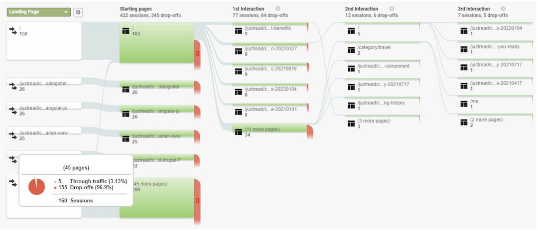
But, when I looked at the User flow report of Google Analytics, I was clear that I am missing out on users navigating through my site.
If you look at the above screenshot of my blog’s Google Analytics report, you will see that the users who land on my blog post don’t do too much after their first interaction. So, this means that a lot of users who are reading one article goes away after reading that and I am not able to retain them for a longer period of time.
Now that I have a clear understanding of the problem, the question that automatically comes up is WHY? Why are the users not going to some other page and interacting with the rest of the content?
Two logical problems which I could think of were:
I get a significant amount of traffic to my blog from Google search results. So, the first point should not be a huge problem. Plus, a lot of my content is technical stuff and I know they are correct. So, it was clear I had to spend time on the second point.
It didn’t take me a lot of time to understand that the problem is with the navigation. The main navigation for my site was in the sidebar and so when users scroll down to read the article and are generally at the end, they don’t have any visual clue to go to any other page. Scrolling up to the top of the page and then going to the other sections of the site is way too much to ask from your audience and hence I am getting such results, right?
So, I decided to do something which goes with the flow - add a related posts section at the bottom of the page.
I saw that many blog websites are now putting up a wide layout and their navigation is on top. However, the navigation items on my website are hardly 3 and hence, a top menu felt like an overkill.
A floating list or blocks in between the content will again take away the simplicity of the site and hence, I felt that a simple related articles block at the end of the article would make sense.
To validate the fact that users like my content and would scroll, I took help from Google Tag Manager and first started tracking the amount of scroll that users are doing on my website. And the results suggested that more than 57% of the users would scroll more than 50% of the page, 43% scroll the article pages beyond 75% and about 39% go till the end of the page.
So, with these observations I added a small block of Related articles links and this small change to the page has already started showing results.
Because of my limited ability with design, I decided to keep things simple and came up with a component which looks like this:

But as we see in many instances, simple things are very effective. This same thing happened to me as well. I can now see a significant amount of traffic going to other articles by clicking on these links.
I even added click events to these related links and that’s how I get metrics about the number of clicks. On top of that, I kept this block’s logic very simple - I build a random list during the build of the Next JS site only, so this is kind of a static block.
Plus, when I look at the user’s flow (screenshot below) I can see that a lot of users are actually navigating to the articles which are actually in the related article block.

This does validate that now I am able to help the users to discover content on my blog easily which is resulting in them spending more time on my site.
Some pointers which I used to validate my theory are:
Based on these points, I now feel that this improvement worked for me. There are so many things that I still want to try out to improve on my site to get more out of it. Let me know what you think about these observations and also what’s your feedback about the overall site and content.