Codeigniter getting ajax data using views

Blog on web and travel
Posted on 28 Feb 2011 by Amitav Roy
Do note, this is a very old article and may not still have relevance
With the web 2.0 style web designs, minimalist designs etc, one thing is certain – fonts are playing a very important part of the visuals of the site. Gone are those days where big images, boxy buttons were “The thing to do”. And another aspect is the different mediums through which our websites are accessed now.
A mobile, PDAs, Notebooks, iPADs and the list goes on. So, the question is how to get the best out of fonts and make them readable across all platforms. Yes, font size plays a very important role and so the unit does matter.
So, what are the different units available to us?
So, the thing is points and pixels are fixed and they will not change their dimensions as per requirement. So, we can stop thinking about them for now. The next two are “Ems” and “Percent”.
Let’s look at some small HTML mark up.
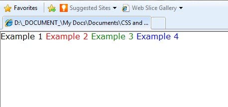
So, here I have 4 span tags with four different class. And each class has a different font size based on different units. And my base font-size, i.e. the body font size is 100%. So, you can see all the text are of the same size:
Now, I will increase the base font-size/body font size from 100% to 200%. You will see that the percent and ems have scaled up, but that was not the case with point and pixel font size text.
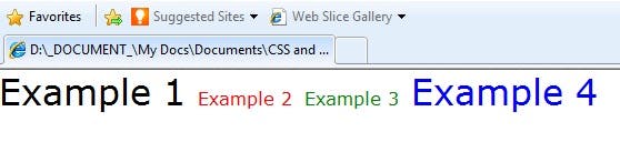
So, you can see that points and pixels were out of the question. And the other one being ems and percent. The major difference between “Ems” and “Percent” is when the browser Text Size is changed like in Internet explorer ems behave in a very strange way. When the text size is smallest, they are almost unreadable and when at the maximum, they are huge. This is adjusted in percentage. Although some may find that better option. But in general, although “Ems” is THE upcoming standard unit for font-size, sometime you may have to rely on percent when you want a platform-independent website.